
TORCH
Austin is the fastest growing large metro in the United States. Even in the pandemic, 154 companies announced plans to relocate or expand to Austin (Samsung, Simon Properties, Tesla, Charles Schwab, etc.). While big business is booming, small businesses have struggled with rising costs for leases, labor, and logistics.
The Problem
Design firms do not have a place where they can find community outreach opportunities. How might we create a platform to connect design firms to local businesses and nonprofits? We believe that businesses have a responsibility to the communities they operate in.
Tools and Deliverables
Figma, Optimal Workshop, Photoshop, Miro
Competitive Analysis, Personas, User Flows, Wireframes, Low Fidelity Mockup, Brand Book, High Fidelity Prototype
Timeline
6 weeks
This project is a concept I developed during the General Assembly UX Design Program.

My Role
I led the research, design, and branding for Torch.
Gathered customer insights by partnering with three design firms to uncover the lack of targeted outreach. I then created a strategy for the design framework to help conceptualize the ideas for the product. Re-defined and changed the scope of the product after thorough user interviews and new business goals. Designed and presented the scope, wireframes, and prototypes.

RESEARCH
Competitive &
Comparative Analysis
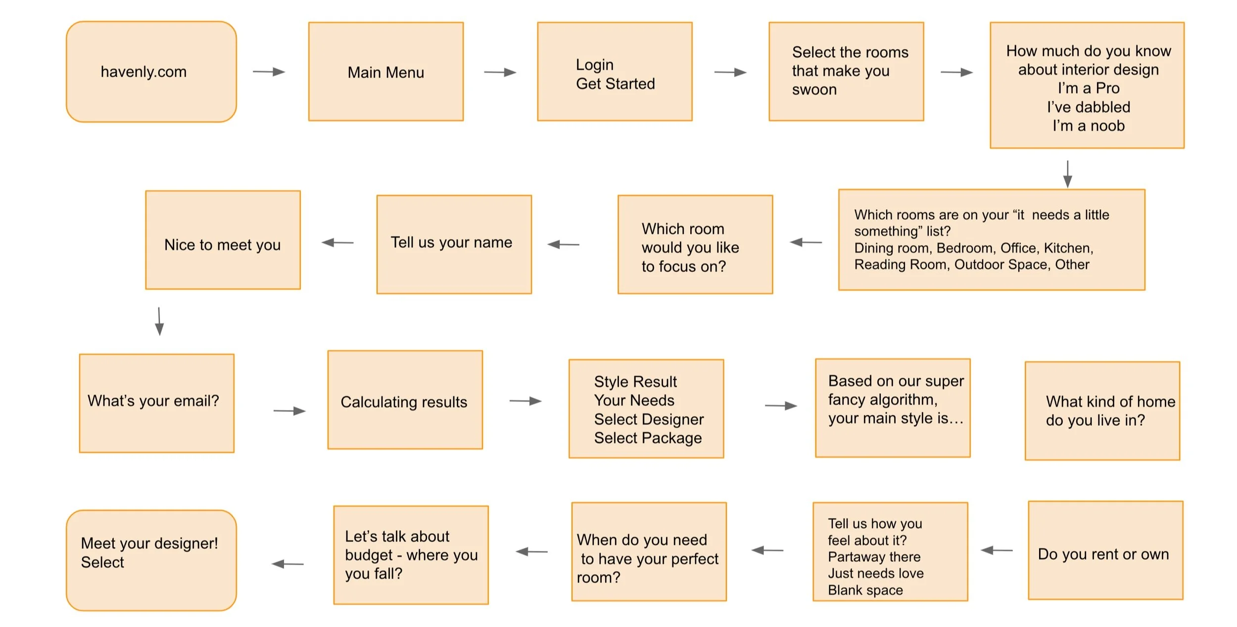
User Task Flow
To really understand what were the most necessary features as well as the industry standard tasks, I reviewed several competitors. Features that were reviewed included app or web presence, personal interior support specialist, fixed price model, social connections, reviews, and ratings. Tasks that were reviewed were recommended listings, chat, filtering, questionnaire, and adding to cart.
Branding
I reviewed the look and feel of Catch A Fire, Modsy, Havenly, and Upwork to see how we could distinguish our brand from the competition. Not only taking into account fonts and color choices but the overall imagery that would match the most with our target user.
Findings
There are no direct competitors specifically in community outreach for design firms. All indirect competitors have both a website and app presence.
Allow the user to browser before having to finalize payment choice
Starting the experience with a questionnaire to get a better understanding of the preferences and create an accurate suggestions
Creating a percentage status so the user knows how many more questions left in the questionnaire
Having a dashboard for the user is a requisite


Catch A Fire
Is a skills based volunteer matching website. Allows a person to volunteer and donate their time to a cause that matches their professional skillset.
Notes: ‘For Individuals’ user flow consists of submitting a quick 2 part questionnaire that then leads to volunteering options. However, cannot move forward without creating a legitimate profile and adding your professional experience (LinkedIn). Must submit a formal application to the org before allowed to volunteer.

Havenly
Is an online interior design company. Matches interior designers with regular people at affordable and fixed prices
Notes: Their website user flow mostly consists of submitting a (quick 6 question) questionnaire that then leads to recommendations sent via email. However, cannot move forward without selecting a payment package.


Upwork
Connects freelancers to businesses. This company helps find great talent for the hiring needs of companies.
Notes: Notably asks how long the work will take. This feature would be very useful to use for our target audience as it helps the firm know whether it’s a project that they can take on.


Modsy
Is an interior design firm that promises transparent pricing where business model is priced based off the individual rooms and designers work around your budget.
Notes: After two questions, must make an account and select payment package choice and payment before moving forward. Feels too soon for the user to make a decision on which plan and to what capacity they would like to make a purchase. Modsy prides itself on price transparency with the user but it might make the buying experience more stressful without enough excitement for the product yet.
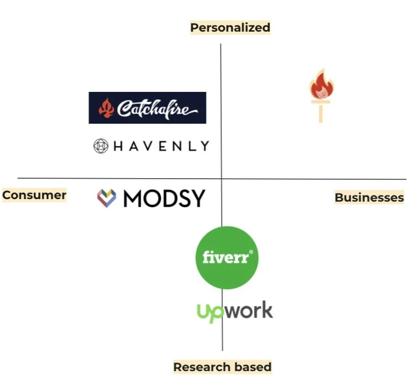
Competitive Map
To continue to understand what were the most necessary features as well as the industry standard tasks, I created a visual representation of the above competitors . Features that were reviewed included app or web presence, personal interior support specialist, fixed price model, social connections, reviews, ratings. Here I identified where the gap in the market was and where our product sits relative to the competition.
As is seen below, Torch is the only product on the market that is for businesses and is personalized. This shows that the features we need to focus should be around creating the most personalized experience for businesses.
Interviews
“You don't have much liability or responsibility when working with a firm.”
Anna H.
“Some firms will host workshops for local people...firms are trying to do outreach”
Kelly W.
“The work is expensive because of all the contractors”
Kelly W.
“It’s now trendy to be conscious”
Rosario G.
Personas
The personas represent the two users that would use our app. One being the employee at the design firm and the other being the small business owner. After completing interviews, it became clear that the target users would be in the 28-38 age range based off of what the design firms stated were the key demographic in the outreach position at the company.

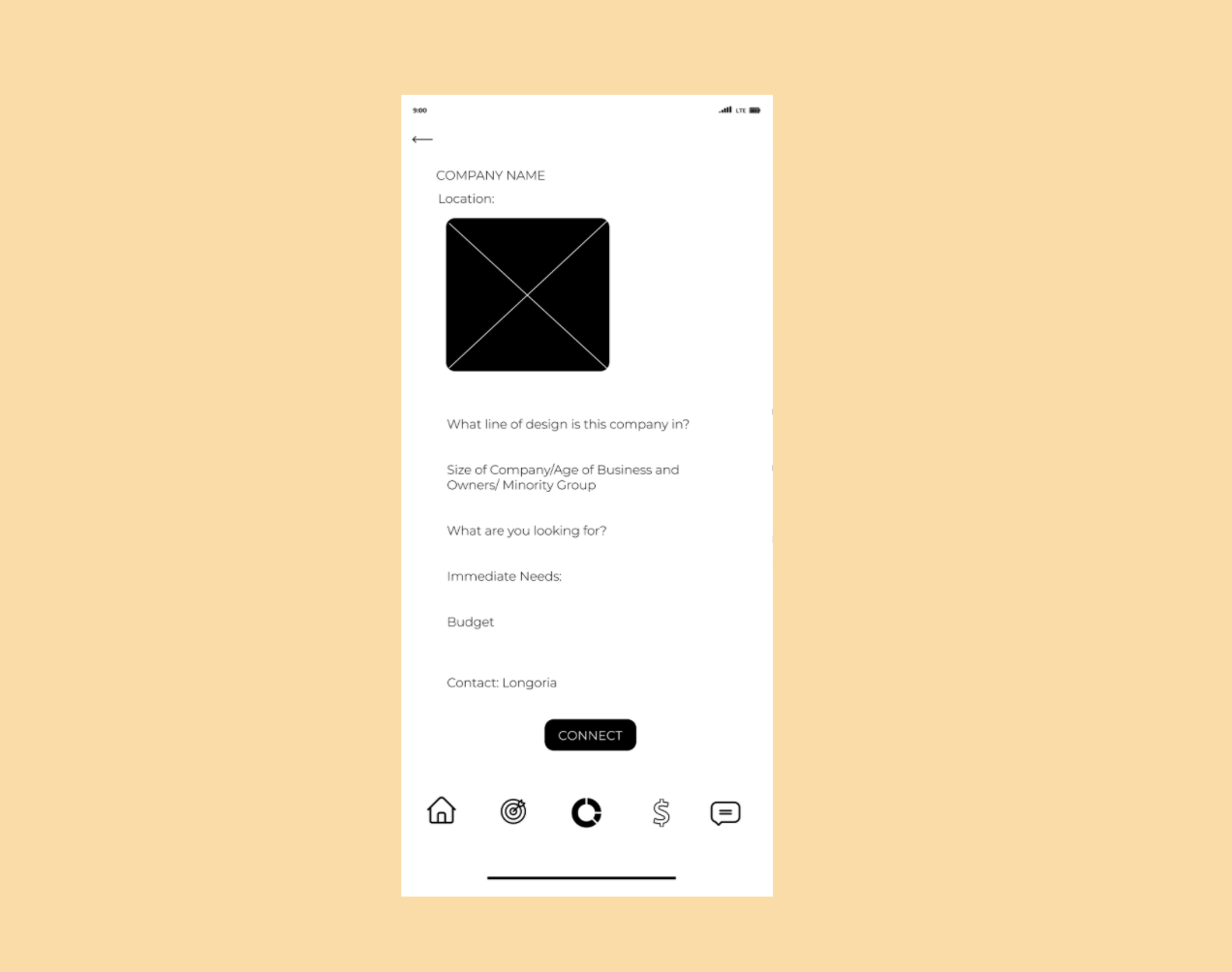
Maria Longoria
Maria is a 30 year old woman who owns a local tire shop. She lives in Austin, Texas where she has her family’s business. She went to a local high school and community college. She is frustrated by the fact that her business is constantly overlooked and that her once flourishing client base and demographic has changed as her surroundings have gentrified. She expects to continue running her family business as it has for the past 40 years. Maria wants a better work space that attracts new clients and creates lasting relationships.

Cynthia Johnson
Cynthia works at an Interior Design Firm as the Community Outreach Manager. She has worked with the firm for 6 years and enjoys the amount of input she gets to have in the decision making process. She works over time to try and find opportunities for her company to be a part of. She is frustrated by the fact that it seems like her company is not doing outreach for individuals that look like her. She wishes there was a database where she could access all the under resources local businesses in town where her company can look through and collaborate with the best matches.
Problem Statement
Design firms do not have a place where they can find community outreach opportunities. How might we create a platform for design firms to have access to the local community.
Solution
We believe that by creating a useful application for design firms that have a large foothold into the architecture of our city, we can open a conversation with small businesses to improve and maintain their place in our cities.
DESIGN
User Flow

Afterwards, conducted open card sorting to re-think the navigation menu and categories in each screen.
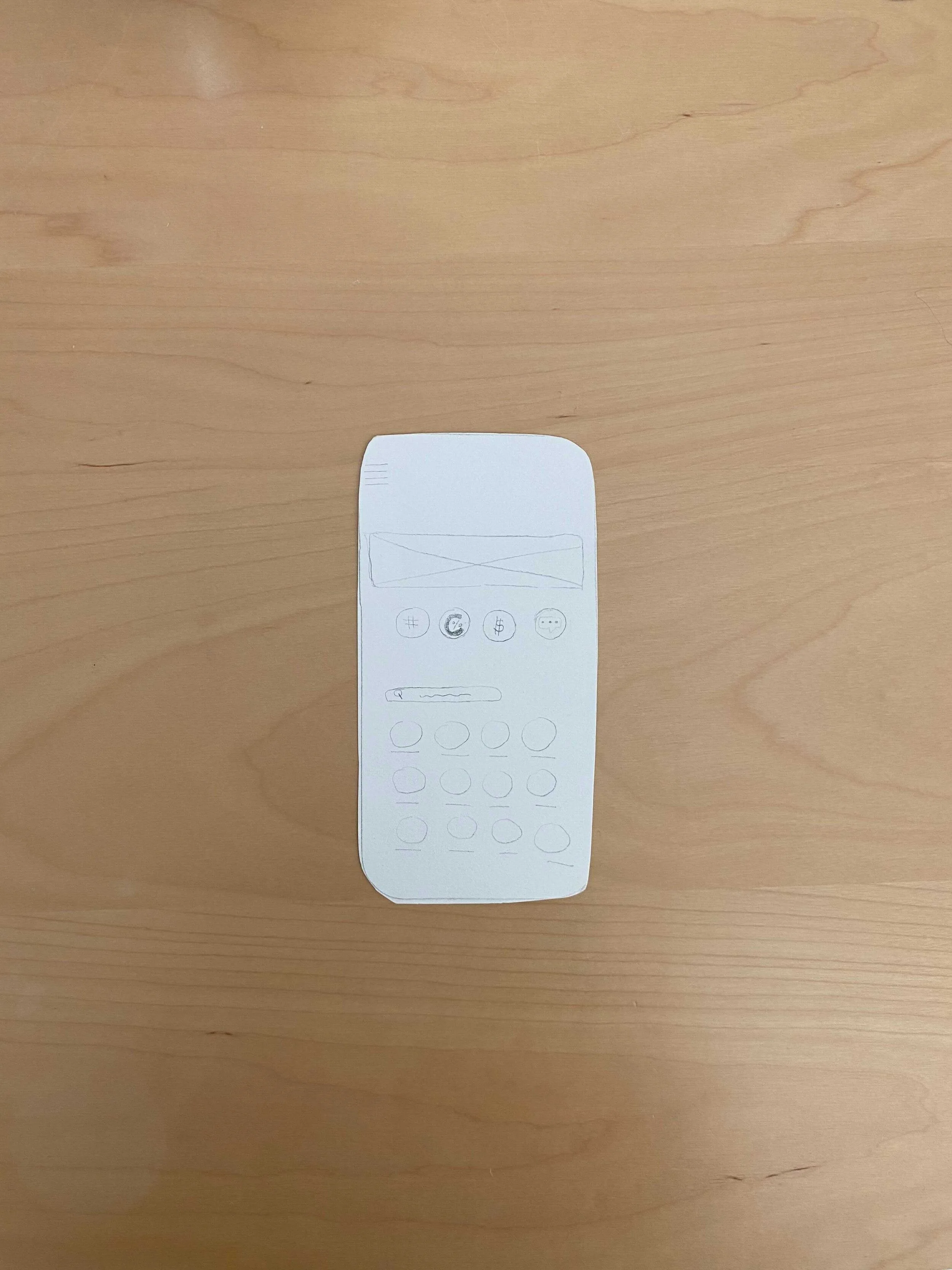
Wireframes


Takeaways
Conducted extensive usability testing before starting on the high fidelity prototype.
Navigation Menu
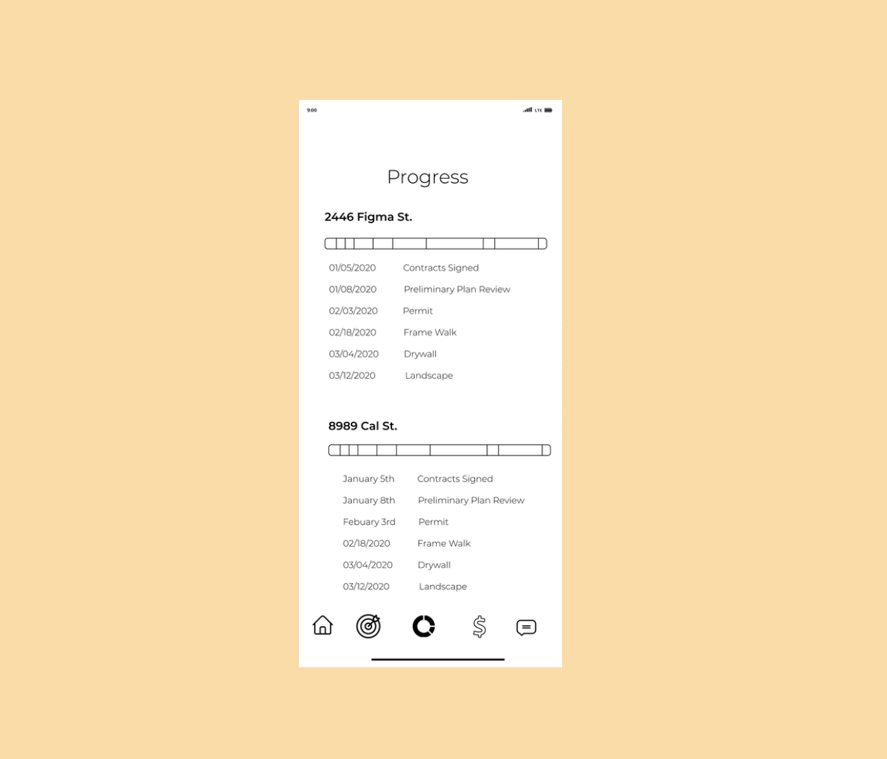
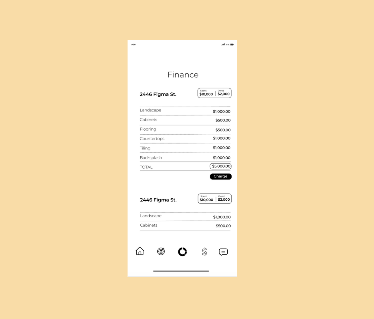
Users did not understand where three of the icons directed to (target, goals, finance). Opted to add text to the navigation menu to give a more clear explanation of what the icon meant. Users had difficulty understanding the difference between the progress and goals screens. Consolidates the finance and progress screens.
Home Screen
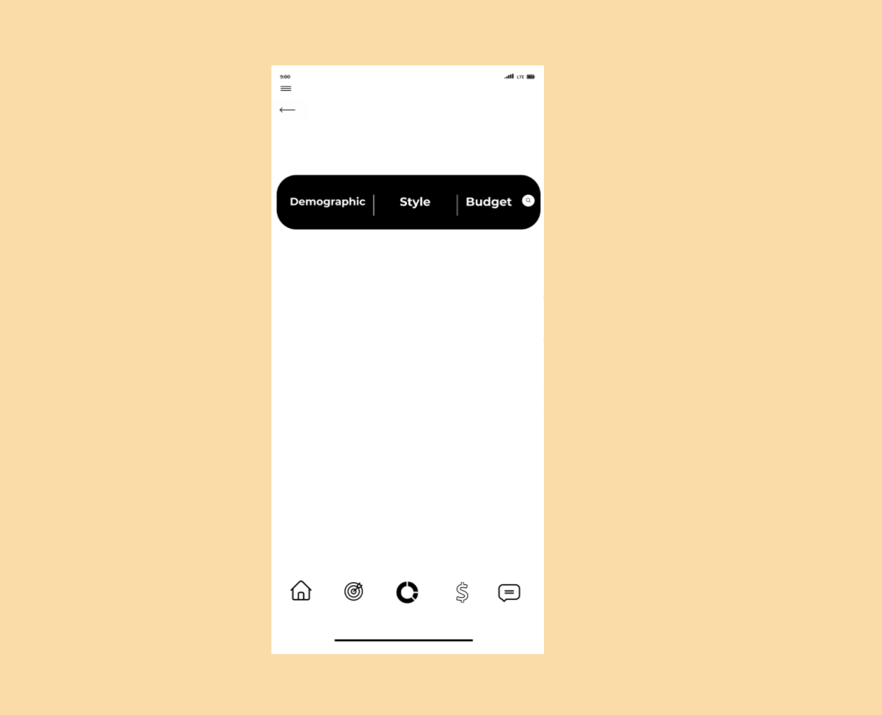
Initially the homes screen showed a dashboard with all buttons to direct to different screens and the search bar on the bottom. Realized that the users were not successfully completing the happy path and knew some adjustments had to be made. Since wanting a user to use the search bar was the most important task, I moved the search bar to the top of the screen. After the changing the search, testers would click on it more often.
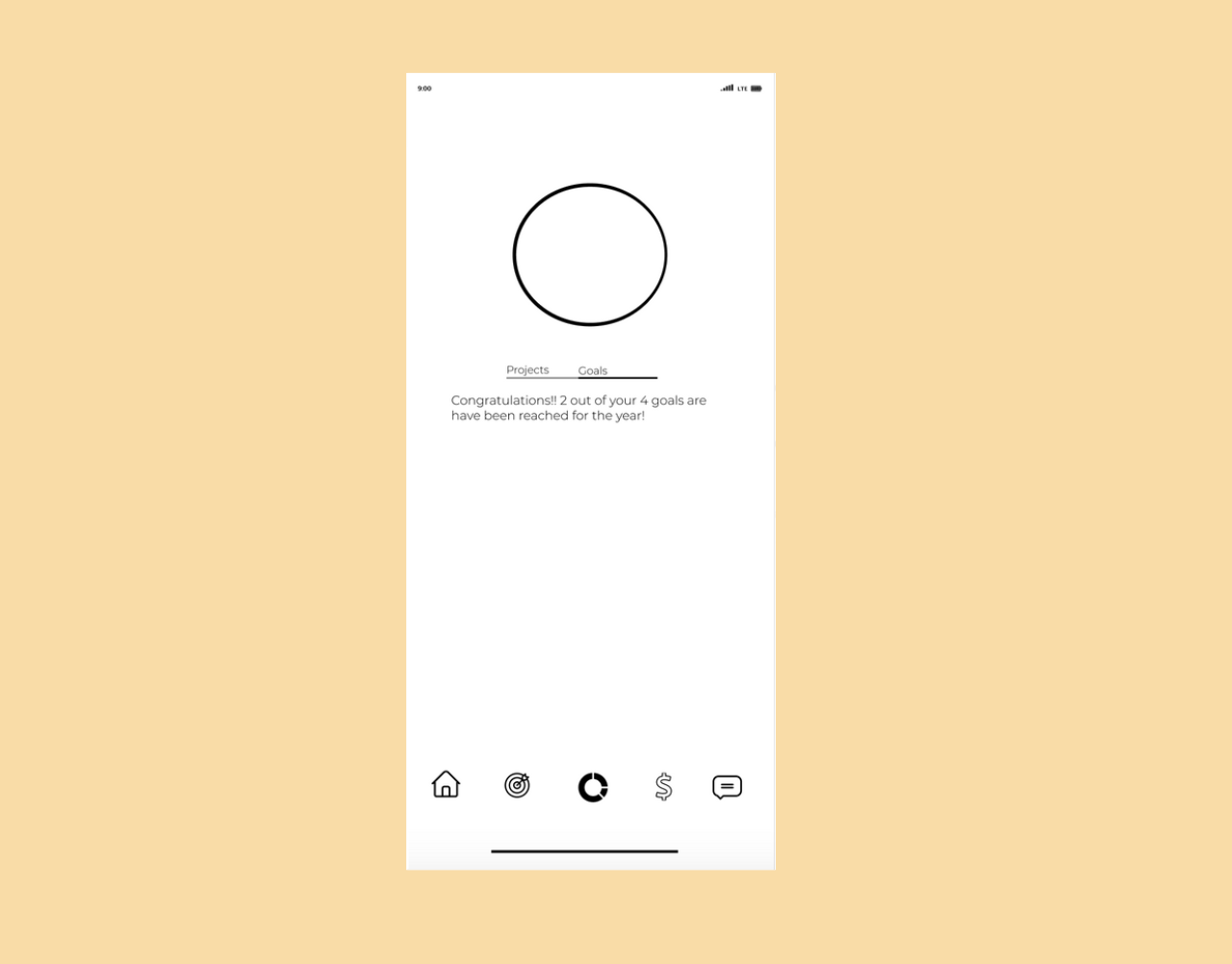
Finance & Progress Screens
At first, having both a finance screen and a progress screen seemed necessary however very quickly it became evident that it would be challenging for users to find a particular project they were looking for. The progress bars in the progress screen were additionally confusing for most users.
Branding
The brand book creates a way for the designer to keep a consistent messaging and visualizations throughout the product. This helps communicate our style and design standards.
We are focusing on a warm tones for the palette. With a focus on tan and red with some light pink accents. Also, incorporating black black and grey text for contrast.
The choice for modern fonts tells a story of professional but relaxed. We want to engage with design professionals and other participants in a way that comes across as approachable. We want our personality of clean and upbeat to match our brand aesthetic.


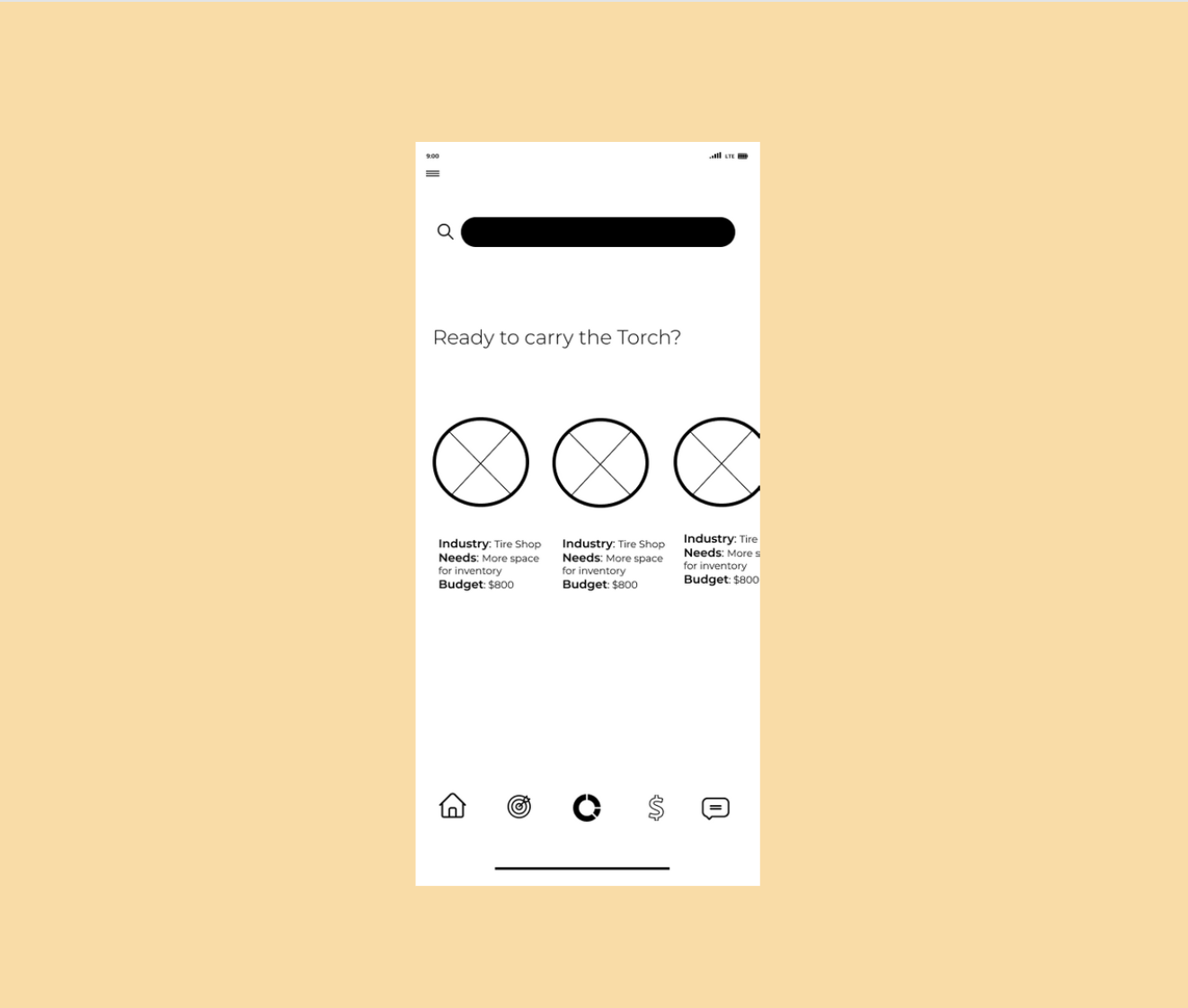
High Fidelity Prototype
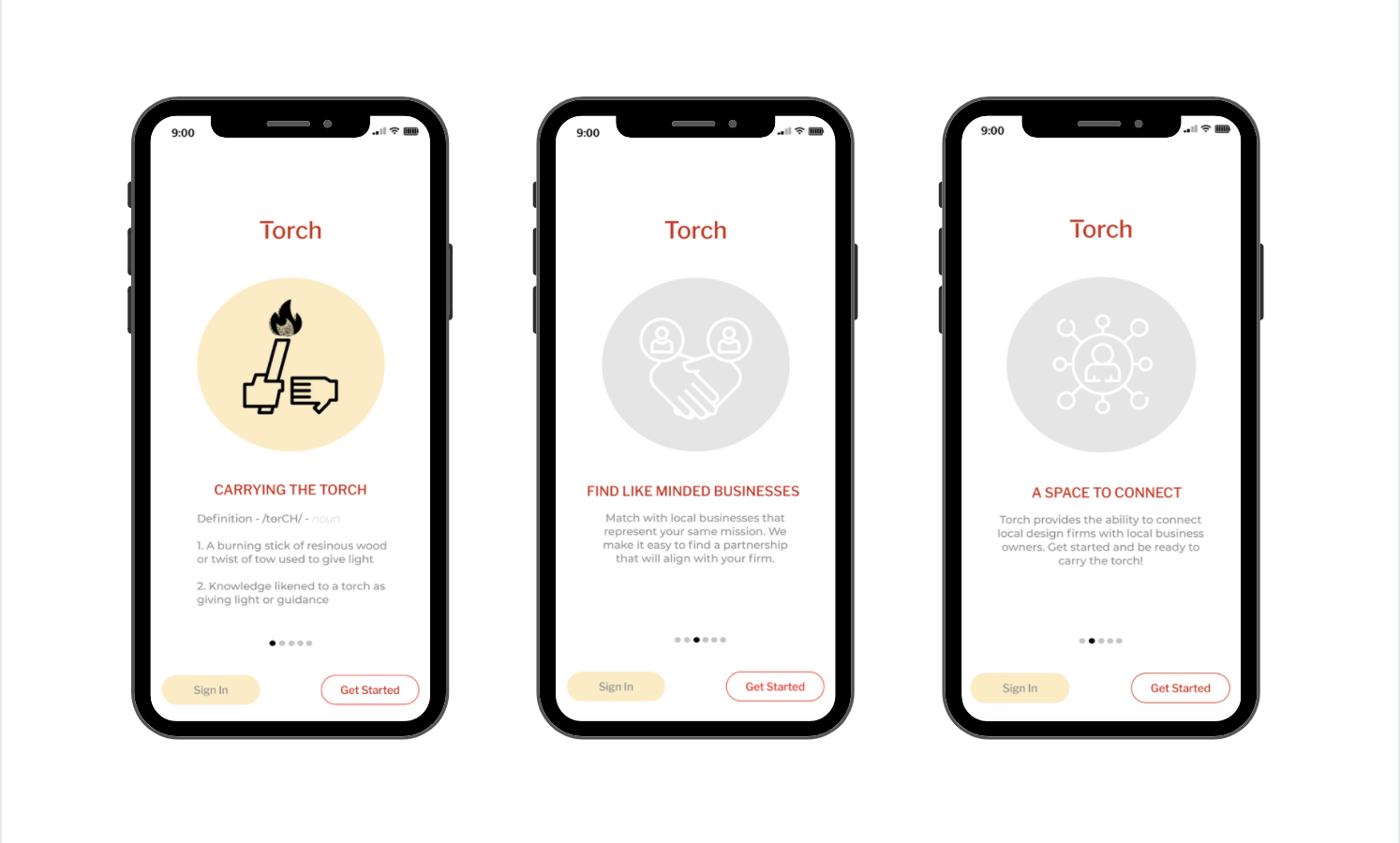
Onboarding screens
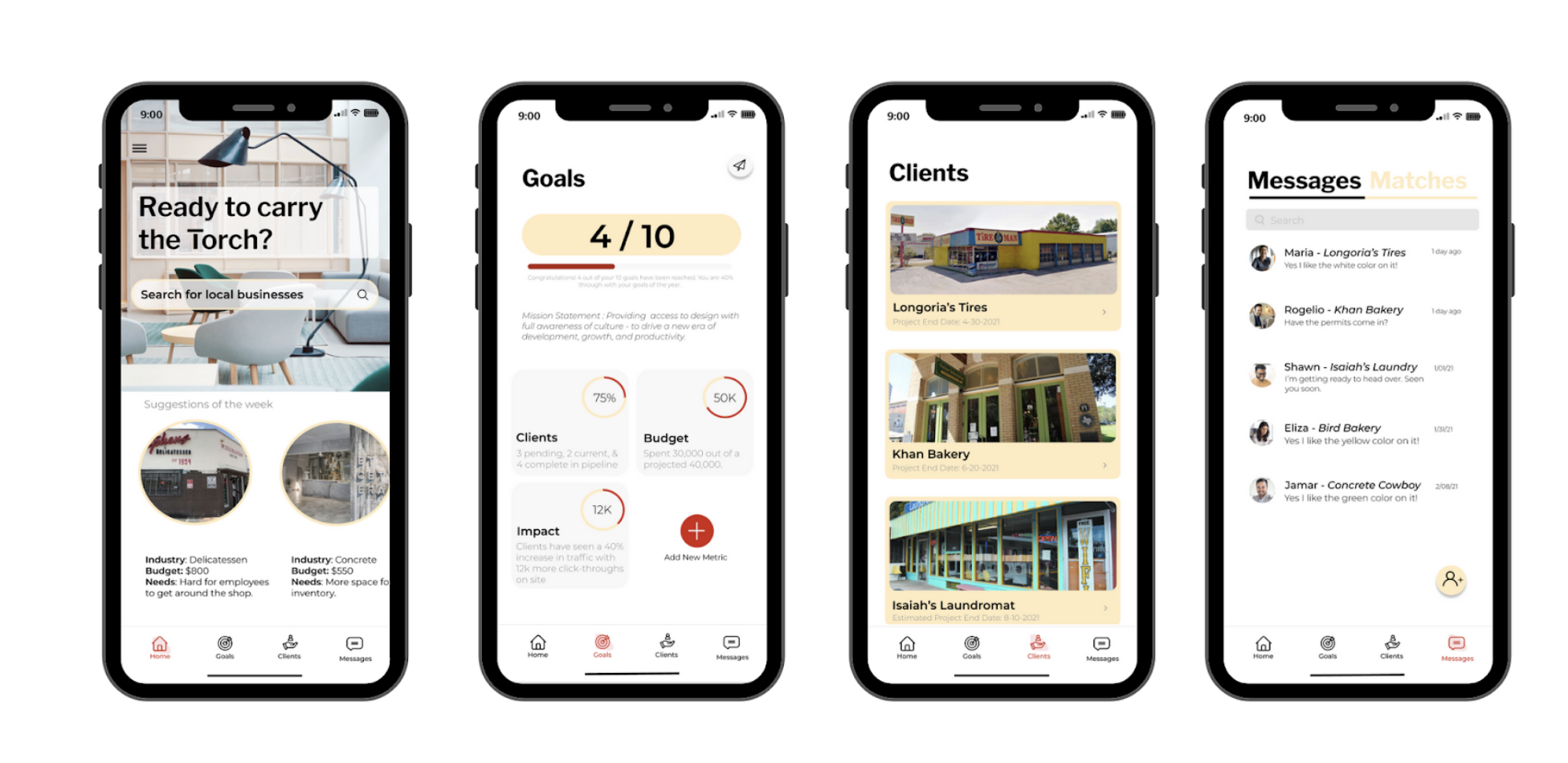
Interface of the Torch app as a Interior Design firm user
Conclusion
After changing the Navigation Menu, Home Screen, Finance Screen and Progress Screen our users were performing significantly better on the application. The final product reduced the number onboarding questions over our screens. After consulting many more users, we’ve been suggested to develop a web version for ease of use during the work day.