iLOCK360 provides identity theft protection for the K-12 market. We had to pair the recent re- branding of the company with the new website development.
The Problem
The current website had two key issues needing improvement. Our interface is outdated and organic users are calling in over questions concerning how to purchase our service. Currently credit card users are only 8% of our revenue. We want to improve the experience for organic online users. How might we use the new branding and intuitive design to facilitate getting to the Sign Up page and completing a purchase.
Tools/ Deliverables
Figma// Competitive Analysis, Competitive Mapping, Art Direction, Brand Book, User Flows, Wireframes, User Testing, Low Fidelity Prototype, High Fidelity Prototype
-
![]()
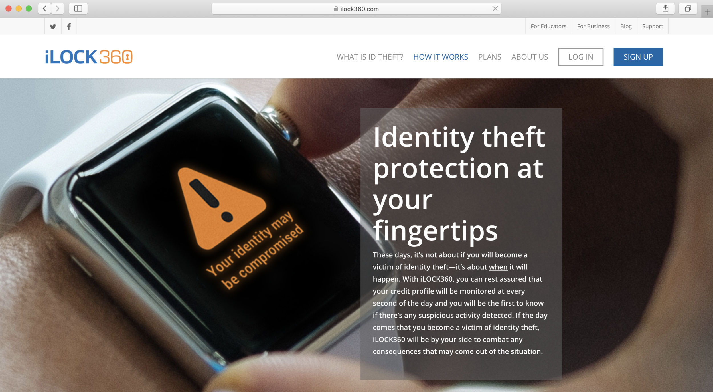
Original Website
HOMEPAGE
-
![]()
Original Website
PLANS PAGE
-
![]()
Original Website
EMPLOYEES PAGE
-
![]()
-
![]()
-
![]()
-
![]()


Re-Branding
First, working closely with graphic designers to create a vision for our brand. We decided early on that our aesthetic would be combining casual elements with illustrations and professionalism with images. What was most important for the team was making identity theft easy to understand. We wanted to display that we can be trusted to be in charge of your identity protection but also, make you feel comfortable with an often times daunting topic.
Shoutout to our amazing graphic designer: Lalo Ramirez Arroyo


Competitive Analysis
LifeLock
LifeLock is currently the leader in identity theft coverage for the average person. Their presence is that of a more serious, and reliable product. They have a vast amount of information and resources on their page that can get overwhelming and hard to follow.

MailChimp
MailChimp is a marketing automation platform. MailChimp has an immense presence with marketing departments of all industries. We took a strong liking to the way in which they present information on their website. With their colors and illustrations, it makes it easy for the user to follow along.

Comparative Map


What People Are Saying
“The website does not make you feel like the product being sold is identity theft protection.”
“My district offered this benefit but I had to call customer service multiple times for assistance on logging in.”
“I’ve had this product for over 5 years and when I retired from my school district, it was very challenging to continue service.”
User Flow
It all begins with an idea. Maybe you want to launch a business. Maybe you want to turn a hobby into something more. Or maybe you have a creative project to share with the world. Whatever it is, the way you tell your story online can make all the difference.


The process
Working alongside our graphic designer to create better user experiences from our current website


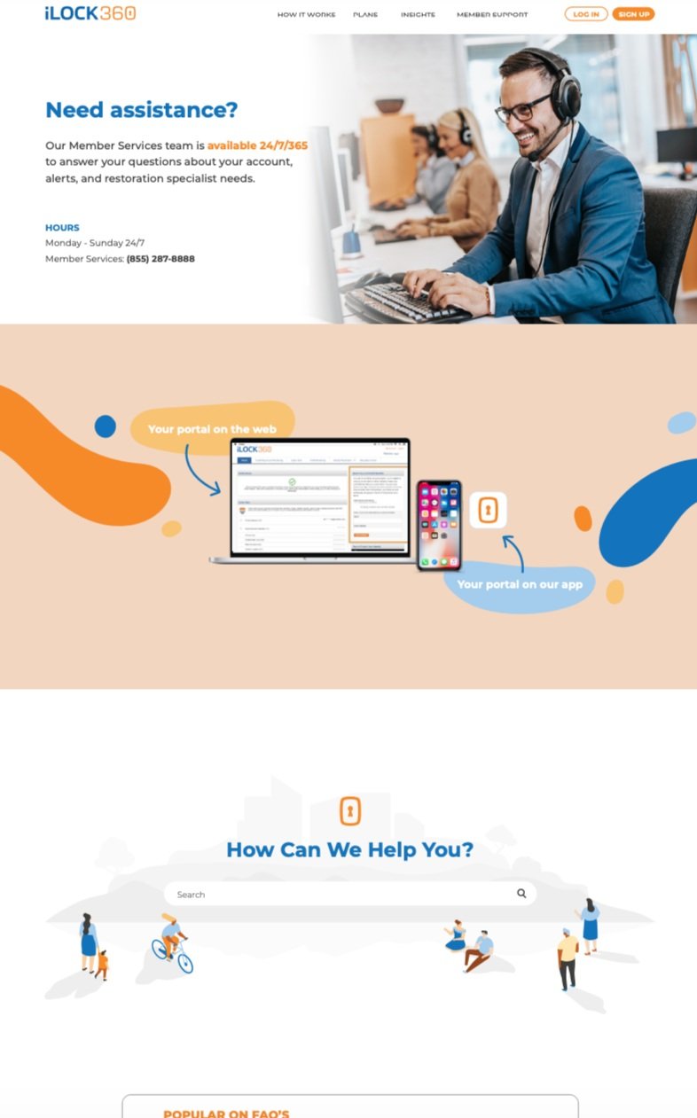
High Fidelity Prototype

High Fidelity Prototype

High Fidelity Prototype


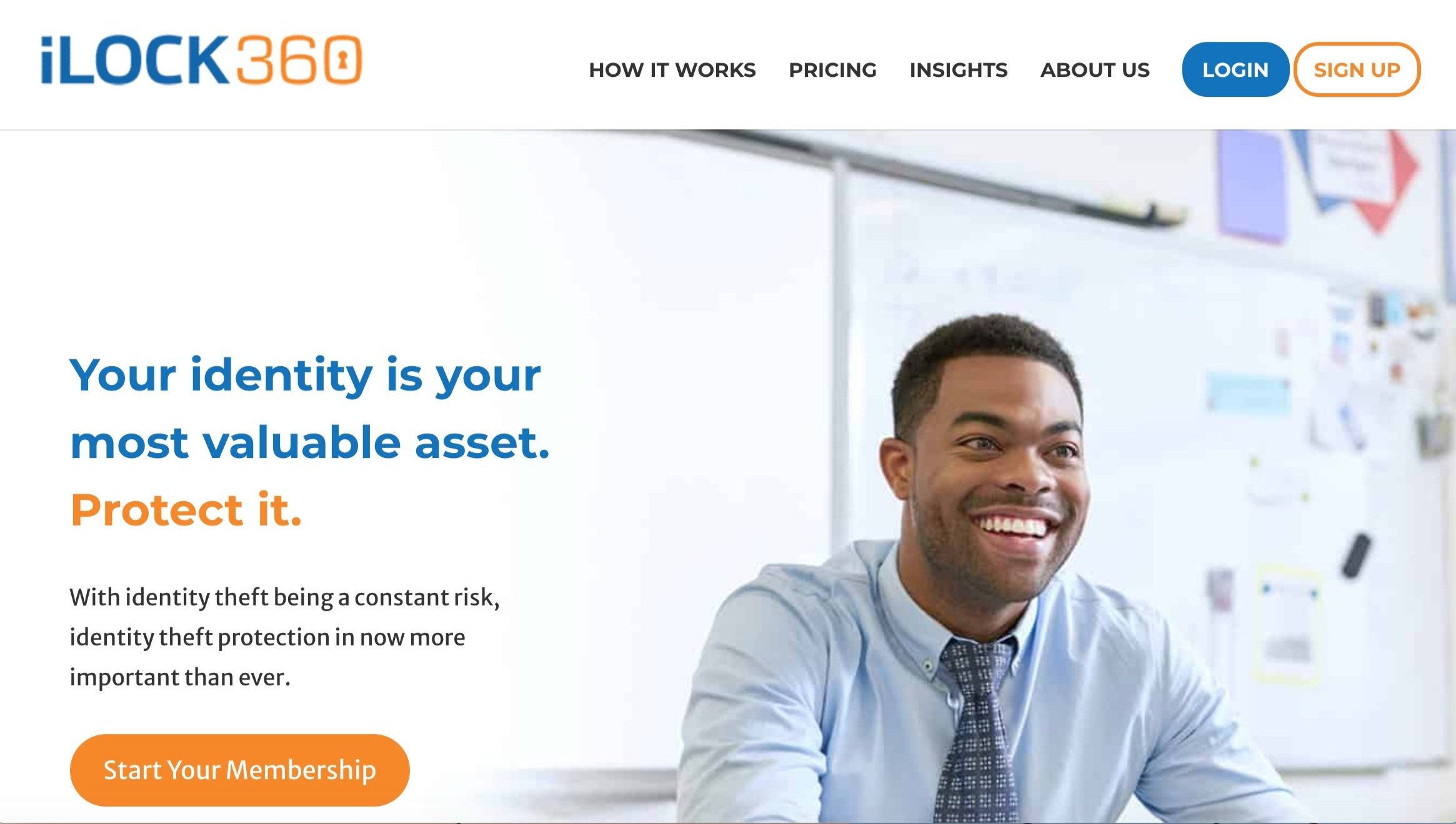
Final

Final
Final
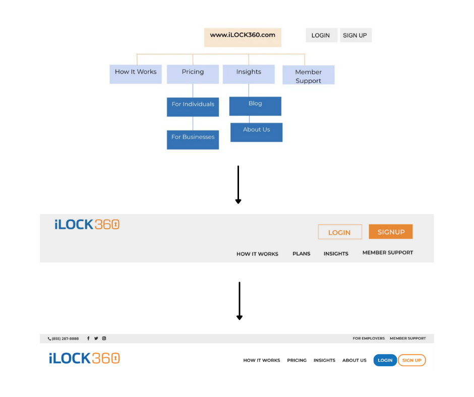
Website Flow


Card Sorting + Usability testing
Key Takeaways
‘Plans’ labeling was switched to ‘Pricing’. Many participants asked about whether we would include Pricing, not knowing that it was located in the Plans page. We decided to change to naming convention to Pricing to avoid confusion and offer users an obvious place to see costs.
We separated ‘For Employers’ and ‘Member Support’ to the top right hand side of the page to draw attention to them and also make it less complicated for a user to find.
Final Live Website
Our website is live at www.iLOCK360.com